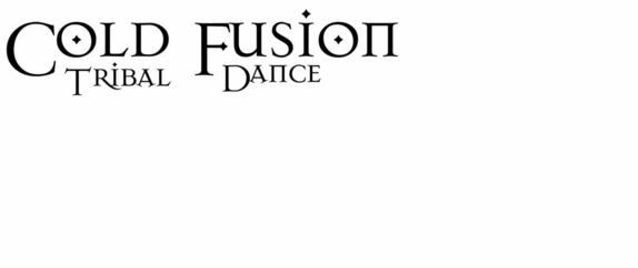
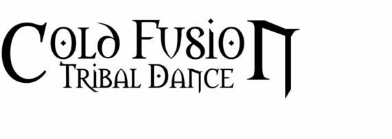
I've been fiddling around with my computer, trying to create a logo for Cold Fusion, my new tribal fusion dance troupe. So far, I've come up with three possibilities.
Option 1
Option 2
Option 3
So, which ones do you like?
Subscribe to:
Post Comments (Atom)
About me
Currently residing in Anchorage, Alaska.
Life in the far north is not always all it's cracked up to be. I can't see Russia from here, but that's probably because of the ice fog.
Life in the far north is not always all it's cracked up to be. I can't see Russia from here, but that's probably because of the ice fog.


10 comments:
Well, I like the second one, with the third being a runner up. But this may be cuz I'm old and I want things neat and tidy. And the first one made my eyes and brain hurt. cuz i'm too old.
I would say one or two. The third one reminds me of an Alaskan Amber beer label, for some reason. Maybe it's just because I want a beer. ;)
two
Tom has also chimed in with a vote. He says number three. One is too busy and two looks like the Lord of the Rings lettering.
Thanks a lot, MG, for hooking me up with DaFont. It's addictive!
Hope votes for number two, posibly number three. Number one was deemed too curly.
Robyn has chimed in with a vote for number three, though she says number two is OK, too.
actually, I like 1. something about the spacing of the letters for #2 makes me not as fond of it.
I like number one, if it didn't have the smudged look. The others use a font that has been getting overused for a lot of things--CD labels, spooky vampire book titles, that sort of thing. It's too goth, and too common.
Actually, I'd say see if you can find something somewhere between the two, since the first one is a bit rounded.
My two cents.
Third. Nice balance.
If you want to clean up No. 1, just import the whole thing into photoshop and erase all the extraneous stuff in the background. The font will likely stand nicely on its own.
Post a Comment